Unifying the Global Money Movement Rails
Reducing support tickets by 50% by abstracting SWIFT, ACH, and SEPA banking infrastructure into a single, user-centric "Single Send" experience that asks who and how urgently, never which rail.
↑ From a "black box" of banking jargon to a single, transparent send flow.
The global liquidity gap
International money movement is notoriously broken. For users, it's a black box of hidden intermediary fees ($25 to $50), unclear delivery times, and banking jargon like SWIFT, IBAN, and BIC that most people have no reason to understand.
That lack of transparency created real user anxiety. Fully half of our support ticket volume was purely "Where is my money?" queries, and failed transfers caused by incorrect recipient data eroded trust even further.
High operational costs from support volume, high churn from failed transfers, and a 24% drop-off rate at the rail selection screen, all traceable to the same root cause: we were asking users to make a decision they had no framework for.
Legacy Experience Audit
- Total black box: no status updates during the 3 to 5 day settlement window.
- Hidden intermediary fees of $25 to $50, disclosed only after the transfer completed.
- Complex banking jargon (IBAN, BIC, SWIFT) with no plain-language explanation.
- Zero error recovery: a failed transfer meant money stuck for up to 10 days.
Bridging bank-grade complexity and user-centric simplicity
My mission was to move the product away from "select a rail" (ACH versus Wire) and toward a mental model users already had: relationship and urgency.
Rail-Agnostic Strategy
Redesigned the core send flow around "who" and "how much," letting a routing engine choose the underlying rail automatically.
Trust & Transparency Design
Built the status architecture and fee-disclosure patterns that replaced the settlement "black box" with a visible, step-by-step journey.
Accessibility-First Interaction Design
Led the WCAG 2.1 AA implementation, from color-independent status shapes to strict keyboard focus order.
Cross-Functional Alignment
Partnered with engineering, compliance, and operations to ship a routing engine that was fast, compliant, and support-light at once.
Three compounding failures behind the churn
A black box with no status visibility
The system gave zero feedback during the 3 to 5 day settlement window. Users felt their money had simply vanished, with no way to check.
Banking jargon nobody asked for
Terms like IBAN, SWIFT, and BIC confused non-expert users and directly drove a 24% drop-off at the rail selection screen.
Zero error recovery
A single failed transfer, often from a simple recipient data error, left money stuck for up to 10 days with a fully manual recovery process.
How might we hide banking rail complexity while keeping full compliance flexibility, so people choose based on what they actually understand, who and how urgently, instead of acronyms they've never needed before?
If we replace manual rail selection with an automatic, rail-agnostic routing engine driven by amount and urgency, and pair it with real-time status and plain-language recovery, then drop-off will fall, support volume will drop, and users will trust the system enough to send money with confidence.
Understanding "the bleed"
I ran an affinity-mapping session on raw interview and support-ticket data, grouping what came back into three themes: fear, jargon, and unmet needs.
Theme: Fear
"I don't know the difference between ACH and Wire. What if I pick the wrong one and lose money?"
User Interview 4
Theme: Jargon
"Routing number? Swift code? I just have their email address."
Support Ticket #892
Theme: Needs
"I use CashApp because it just asks 'how much?'. I want that here."
User Interview 11
Heuristic evaluation against Nielsen's 10
Visibility of System Status · Failed
Zero feedback during the 3 to 5 day settlement window. Users felt the money had "vanished."
Match to Real World · Failed
Used terms like IBAN, SWIFT, and BIC without explanation, confusing non-expert users.
Error Prevention · Failed
No validation on input fields let users send money to invalid account numbers, causing failed transfers.
Quantifying the friction
↑ Complexity, not cost, was the bigger blocker. Three times as many users dropped off from confusion as from the fee itself.
Key research insight
"I use CashApp because it just asks 'how much?'. I want that here."
User Interview participant, on why a consumer app felt more trustworthy than the bank's own transfer flow
What the research made clear
Complexity, not cost, was driving people away
Three times as many users abandoned the flow from confusion as from the fee itself, which meant simplifying the decision mattered more than discounting it.
Users think in relationships and urgency, not banking rails
An open card sort with 30 participants showed people grouping transactions by "family versus business" and "how soon," never by the underlying technology.
Perceived transparency reduced anxiety more than raw speed
Surfacing the compliance check as a named, visible step, rather than a silent delay, measurably increased how secure the transfer felt, even though the actual processing time didn't change.
The rules we designed by, and why
1 · Rail-agnostic by default
Derived from users grouping transactions by relationship and urgency, never by rail, in card sorting.
→ Removed the "select transfer type" screen entirely, replaced with automatic routing by amount and urgency.
2 · Make the invisible visible
Derived from zero feedback during settlement making money feel like it had vanished.
→ Built a live status architecture, Initiated, Compliance Check, Intermediary Routing, visible at every step.
3 · Turn compliance into reassurance
Derived from perceived security rising once the compliance check became a visible, named step.
→ Displayed sanctions screening as a deliberate step, not an invisible backend delay.
4 · Plain language over banking jargon
Derived from IBAN, SWIFT, and BIC directly driving a 24% drop-off at rail selection.
→ Replaced technical terms with outcomes: "Standard" and "Instant," "Cheapest" versus "Fastest."
5 · Accessible by construction, not by retrofit
Derived from a WCAG audit flagging color-only status indicators as unreadable for colorblind users.
→ Added shape-coded status alongside color, strict keyboard tab order, and plain-language error messages from day one.
Three phases that de-risked the solution
01 Phase 01 Discovery & Alignment
I brought Product and Engineering together to map assumptions mapping, what we thought users knew about banking rails versus reality. Stakeholders had overestimated user literacy, so we agreed to hide technical terms entirely. I paired this with competitor benchmarking: Wise and Revolut never make users choose a rail, they ask "who" and "how much" first, which gave the direction real data-backed buy-in.
02 Phase 02 Defining the Mental Model
I ran an open card sort remotely with 30 participants, asking them to group 20 distinct transaction scenarios however made sense to them. They grouped by relationship (family versus business) and urgency, never by technology. That result validated removing the "select transfer type" screen entirely.
03 Phase 03 Accessibility-First Design
With the mental model validated, I designed a progressive-disclosure interface that only reveals complexity when necessary, defaulting to the cheapest option with a toggle to "Fastest." Alongside it, I ran a full WCAG 2.1 AA pass: plain-language error messages, a defined keyboard tab order, and shape-coded status indicators for colorblind users.
The choices that shaped the outcome
Decision 01 · Automatic routing vs. user-selected rail
Tension: Automating the rail choice risks users feeling like they've lost control over a financial decision.
Choice & trade-off: We automated it anyway, defaulting to cheapest with a "Fastest" toggle, because card sorting showed users never had a mental model for rails to begin with, only for relationship and urgency.
Decision 02 · Surfacing the compliance check vs. hiding it
Tension: Showing "compliance check running" as a visible step could raise as many questions as it answers.
Choice & trade-off: We showed it anyway, as a named, deliberate step. This specific transparency measurably reduced anxiety compared to the original black box.
Decision 03 · Optimistic UI vs. waiting on real backend confirmation
Tension: Engineering flagged 800ms-plus API latency on the routing decision, enough to make the flow feel slow.
Choice & trade-off: I proposed skeleton loaders and optimistic UI updates that kept perceived friction at zero while the backend processed, without ever hiding the real status once it was available.
One send flow, three trust signals
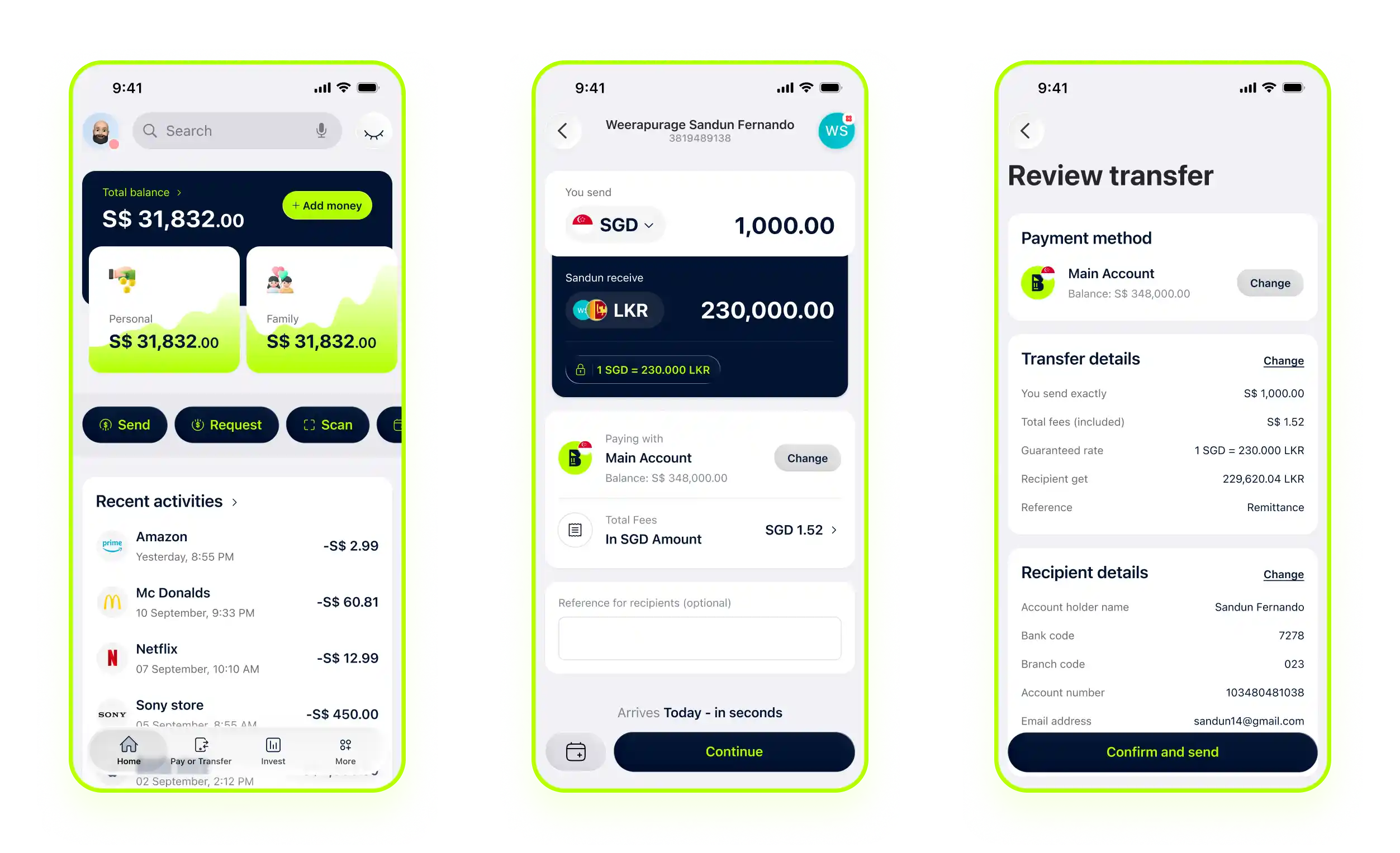
↑ The rail-agnostic send flow: users choose who and how urgently, the routing engine handles the rest.
Fee Transparency
Guaranteed FX rates and an upfront breakdown of intermediary fees eliminate post-transfer shock.
Predictive Delivery
Settlement estimates are based on corridor history and bank cut-off times, not a generic "3 to 5 days."
Sanctions Pre-Check
Real-time OFAC and AML screening runs before fund commitment, preventing money from getting stuck mid-transfer.
Optimized for cross-border transactions
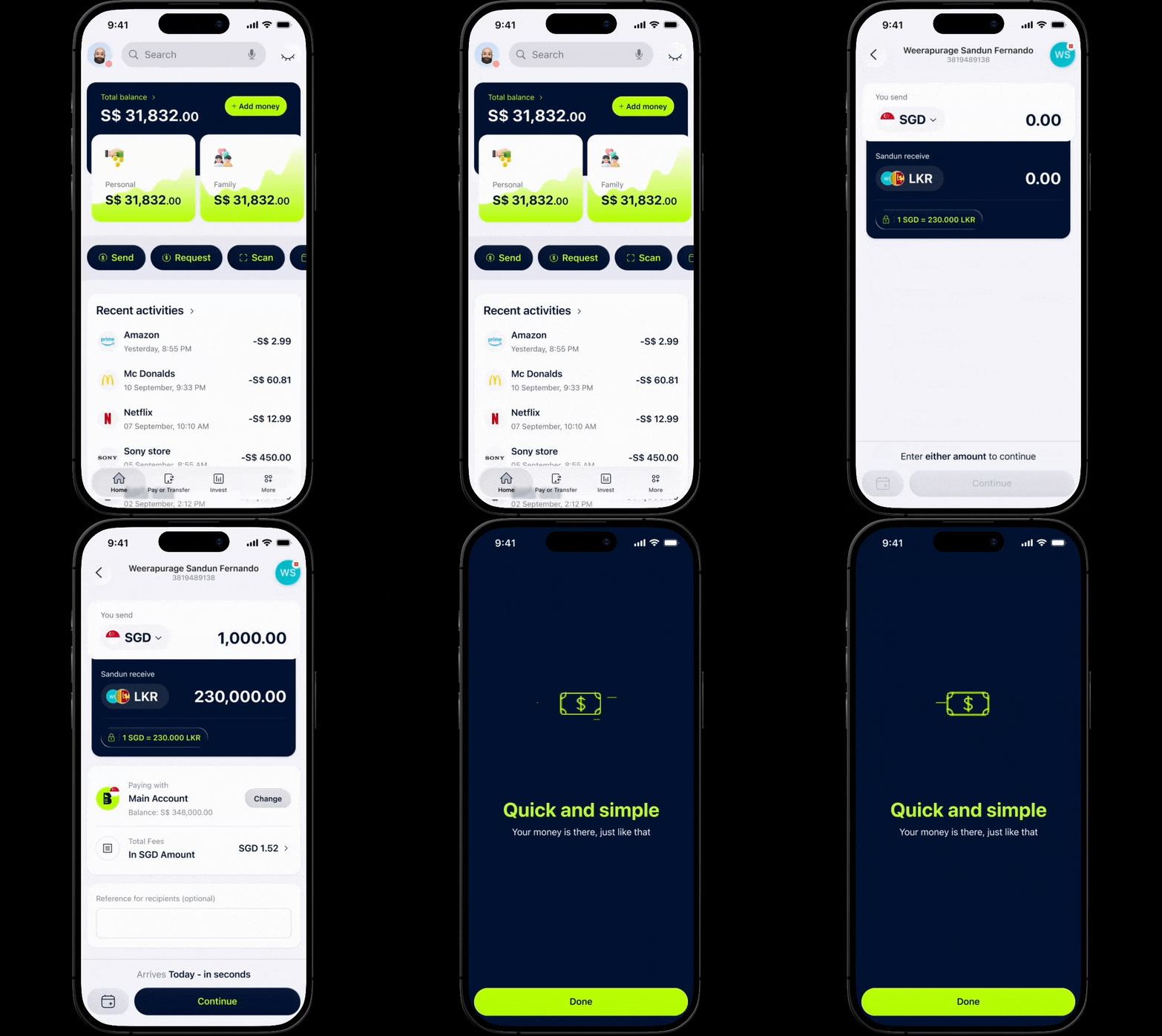
Send funds across borders with real-time exchange rates and no hidden fees.
- Transparency and security at every step of the journey.
- A clear roadmap of the money's journey, from initiation to deposit.
Design doesn't happen in isolation
Engineering: making automation feel instant
Worked closely with backend teams to optimize API response times and implement the optimistic UI patterns that masked 800ms-plus routing latency.
Compliance: aligning speed with regulation
Partnered on OFAC and AML screening triggers to reach 100% regulatory adherence without ever blocking the user's flow.
Product & operations leadership: validating the payoff
Partnered on corridor-specific localization priorities and confirmed that automated status updates and self-healing recovery could absorb the support burden that used to fall on operations.
How we arrived at the solution
Task Analysis
Broke down the 14-step corporate wire transfer process to identify where finance managers were resorting to external spreadsheets.
Cross-Border Edge Case Brainstorm
Collaborated with Treasury and Engineering to map edge cases like currency holidays, failed settlements, and intermediary bank delays.
Illustration Placeholder
Prompt: A stylized illustration of a research workshop mapping payment corridors and edge cases at a whiteboard, treasury and product teams collaborating, in lime-green and dark-navy accent tones. Rendered as a clean illustration on a fully transparent background (no backdrop, scene, or color fill), so it displays cleanly on both light and dark page themes.
From black box to trusted, transparent transfers
The rail-agnostic flow also lifted funnel conversion by 18% and saved the operations team roughly 20 hours a week that used to go to manual "Where is my money?" investigations.
Honest reflections from the process
What Worked
Perceived performance can matter more than actual performance
Engineering pushed back on smart routing over 800ms-plus latency. Skeleton loaders and optimistic UI kept perceived friction at zero while the backend caught up, without hiding the real result.
Plain language is the highest-leverage tool in fintech UX
Replacing "ACH" with "Standard delivery (1 to 3 days)" reduced cognitive load more than any visual redesign could have. Copywriting did more work here than layout.
What I'd Do Differently
Integrate real-time tracking sooner
SWIFT gpi data for minute-by-minute fund location across intermediary banks would have deepened the transparency story from day one, rather than as a later addition.
Build smarter recipient validation earlier
AI-based typo detection for recipient names and account numbers, tuned per corridor, would have prevented a meaningful share of the failed transfers we instead caught after the fact.