Mobile-First Design for Users Under Pressure
Redesigning the PickMe driver app for the real environment where drivers use it heavy traffic, bright sunlight, and a 20-second window to make a critical financial decision.
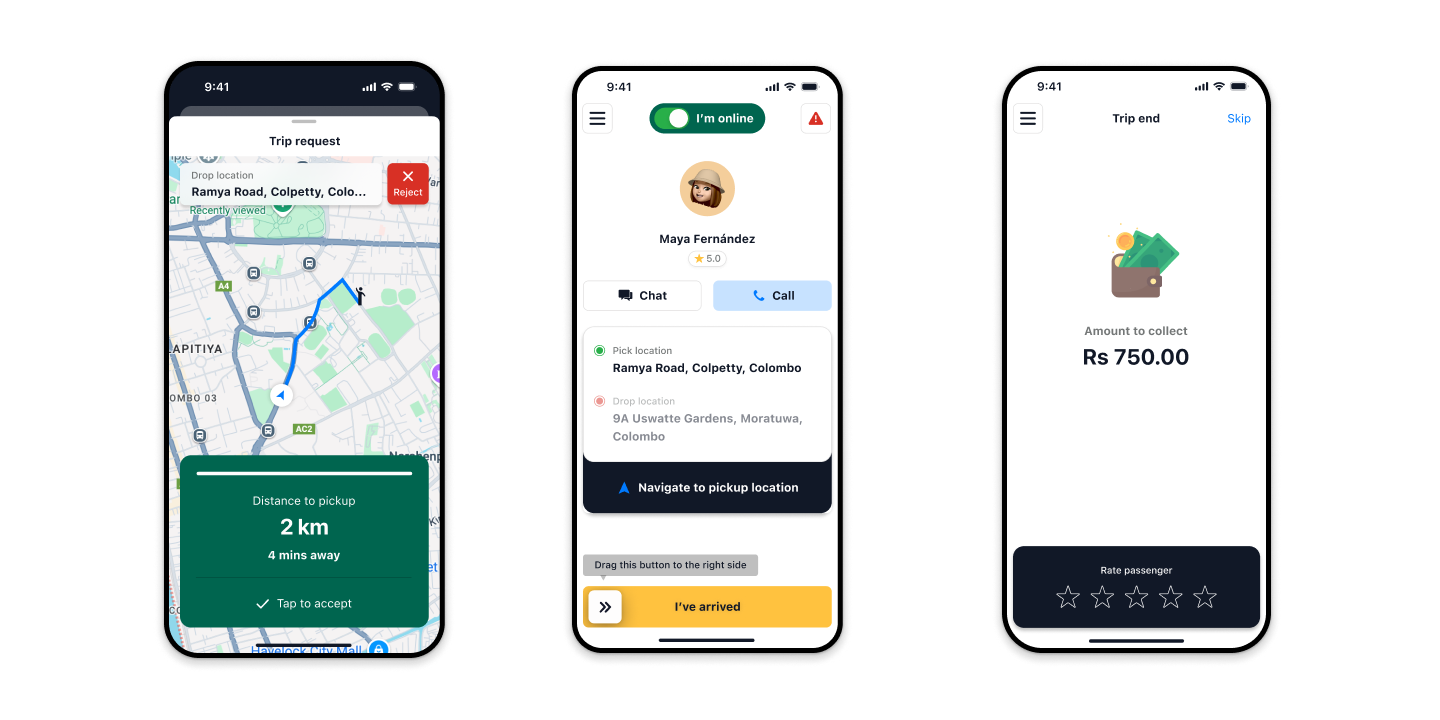
↑ The redesigned PickMe driver app built for one-handed use, in direct sunlight, with a 20-second decision window.
PickMe was growing fast. The driver app wasn't keeping up.
PickMe launched in Sri Lanka as a challenger in a market dominated by one global player. Early traction was strong, but the driver-side product had a serious problem: drivers were accidentally rejecting trip requests they wanted to accept. The UI had been built for ideal conditions it failed completely in the conditions where drivers actually used it.
Drivers operate in extreme environments. They're navigating traffic, their phone screen is washed out by direct sunlight, they're making rapid, one-handed decisions. The app had small buttons, low-contrast text, and a UI that demanded more attention than any driver safely give it. The result was a 15% accidental rejection rate meaning 1 in 7 trip requests was being refused by drivers who would have accepted the trip if the interface had let them.
I joined as Lead UX Designer to rebuild the trip acceptance experience from the ground up starting with field research before touching any design tool.
What I owned on this project
I was the Lead UX Designer embedded with the PickMe product team across the full design cycle from field research through to high-fidelity prototyping and validation.
Field Research
20 ride-along sessions with active PickMe drivers observing real-world app usage in live traffic conditions, not a usability lab
User Research
In-depth driver interviews (n=20), Sinhala/Tamil bilingual sessions, focus groups mapping driver earnings psychology and rejection anxiety
Interaction Design
End-to-end redesign of trip acceptance flow swipe gesture, haptic feedback, WCAG AA+ accessibility for outdoor visibility
Cross-functional Facilitation
Journey mapping workshops with VP Operations, PMs, and engineering translating field constraints into shared team understanding
Three compounding failures costing drivers income and the platform supply
A 15% accidental rejection rate was costing drivers real money
When a driver accidentally rejected a trip request, they didn't just lose that fare they were penalised by the platform algorithm, reducing their likelihood of receiving future requests. The "Accept" and "Decline" buttons were small, close together, and appeared without sufficient contrast differentiation. In vibrating vehicles with one-handed operation, mis-taps were frequent.
Evidence: Platform data showing 15% trip rejection rate + driver interviews where the majority described accidental rejections as a frequent, frustrating experience.
The UI was designed for ideal conditions. Drivers operate in the opposite of ideal.
The existing app had been designed on desktop Figma files, reviewed in offices, and tested in labs. Nobody had sat in a tuk-tuk at noon in Colombo, with the sun at full intensity, phone screen at full brightness, navigating a roundabout with one hand, and 18 seconds left on a trip timer.
20 field ride-alongs revealed that the real environment fundamentally broke assumptions the design was built on: text contrast failed in direct sunlight, touch targets were too small for moving-vehicle taps, and the information hierarchy prioritised data that was secondary to drivers' actual decision-making process.
Evidence: 20 ride-along sessions observing real-world usage, field photos, screen recordings, observed failure patterns in live conditions.
Drivers needed to make a confident decision in under 20 seconds the UI made that impossible
A trip request in the PickMe app appeared for approximately 20 seconds before auto-declining. Within that window, a driver needed to assess pickup distance, destination direction, estimated earnings, and traffic context then respond. The original interface showed this information as dense text, in a layout that required reading and parsing under time pressure.
Driver interviews revealed a clear pattern: experienced drivers had developed workarounds covering one button with their palm, memorising screen positions, using the sound as a trigger. These were adaptations to a broken design, not signs of a working one.
Evidence: Driver interviews (n=20) and journey mapping sessions - mapping cognitive load across the 20-second "Trip Request Window."
How might we redesign the trip acceptance experience so that a driver moving through heavy traffic, in bright sunlight, can make a confident decision in under 5 seconds without risking a mis-tap that costs them income?
If we redesign the trip request interface around the driver's physical reality larger touch targets, ultra-high contrast for outdoor visibility, haptic differentiation between accept and decline, and a visual hierarchy that surfaces the single most important decision variable first then we will reduce accidental rejections and improve driver confidence and earnings satisfaction.
Getting into the cab before getting into Figma
The most important decision I made on this project was to start with 20 ride-along sessions before any design work. Not because it was scheduled but because the assumptions baked into the original app were all wrong and only field observation would surface that.
Each ride-along was a structured observation session: I sat in the back seat, observing the driver's phone interactions, noting failure moments, recording screen state during key events. I also conducted post-session interviews on earnings psychology, rejection anxiety, and what drivers wished the app understood about their job.
Ride-Along Field Research · n=20
20 sessions with active PickMe drivers - observing screen interactions in live traffic, noting failure patterns, photographing phone screen legibility in direct sunlight.
Driver Interviews · n=20
In-depth sessions post ride-along. Conducted in Sinhala and Tamil. Topics: earnings psychology, rejection consequences, workarounds, what information matters most in the request window.
Journey Mapping Workshop
2-hour facilitated session with VP Operations, PMs, and junior designers. Mapped the 20-second trip request window plotting cognitive load, physical environment, and emotional state across each second.
Platform Data Analysis
15% rejection rate broken down by time of day, location type, and driver experience level. Correlated with field observation to distinguish intentional from accidental rejections.
↑ Field research in action 20 ride-along sessions observing real-world driver app usage in live Colombo traffic conditions.
What 20 ride-alongs taught us that desk research never would
Drivers don't read the trip request they scan for one signal
In 20 seconds, experienced drivers weren't reading the full trip details. They were looking for one thing first: pickup distance. If it was nearby, they accepted. If far, they weighed it against earnings. The original UI buried pickup distance below destination and price the exact wrong hierarchy for how drivers actually decide.
Accidental rejections were emotionally devastating not just financially costly
Drivers described accidental rejections with language that reflected shame and frustration I can't believe I tapped the wrong button again. The platform penalised them with fewer future requests. This created a stress cycle that affected focus and increased the likelihood of future errors. The UI wasn't just costing income it was damaging confidence.
Many drivers were functionally illiterate in the app's primary language
A significant portion of drivers were more comfortable in Sinhala or Tamil than in English yet the app defaulted to English for all critical decision UI. More significantly, some drivers had limited reading ability in any language. This meant icon design and colour coding were not just accessibility features they were primary communication channels.
The journey mapping workshop changed the team's shared language
After the journey mapping session, the team stopped using the phrase "the trip acceptance screen." They started calling it "the 20-second window." That language shift changed what we optimised for from a screen to a human moment under specific physical and cognitive constraints.
The constraints we designed by each grounded in field evidence
1 · Design for the worst-case environment, not the average one
Derived from field observation: the worst conditions (noon sun, moving vehicle, one-handed use) are not edge cases they are the typical use case.
→ WCAG AA+ contrast ratios enforced throughout. Minimum 48px touch targets. No fine-detail interactions.
2 · Surface the one signal that drives the decision first
Derived from observation that experienced drivers scan for pickup distance as the primary accept/decline signal not the destination.
→ Pickup distance as the largest visual element. Destination and earnings at secondary hierarchy.
3 · Make "confidence" the first affordance before speed
Derived from driver interviews describing accidental rejections as emotionally damaging. A mis-tap was worse than a slow tap.
→ Swipe-to-accept replacing tap requiring intentional directional gesture, not a point-and-tap that could misfire.
4 · Icons and colour must carry meaning without language
Derived from discovering a significant share of drivers had limited English literacy and some had limited reading ability in any language.
→ Icon-based trip type indicators validated with low-literacy users. Colour-coding tested for both daltonism and sunlight visibility.
How we tested ideas before committing to them
Every design direction was tested against the constraints identified in field research. We ran three distinct ideation phases, each with a specific validation method.
Constraint-Driven Crazy 8s "Design for someone who can't read English, in sunglasses, with a shaking thumb"
Each participant in the Crazy 8s session received a constraint card before sketching: "Your design must work for someone wearing sunglasses, tapping with a shaking thumb, who cannot read English." This single constraint changed the outputs dramatically pushing the team toward large touch targets, icon-first layouts, and gesture-based interactions from the very first sketch.
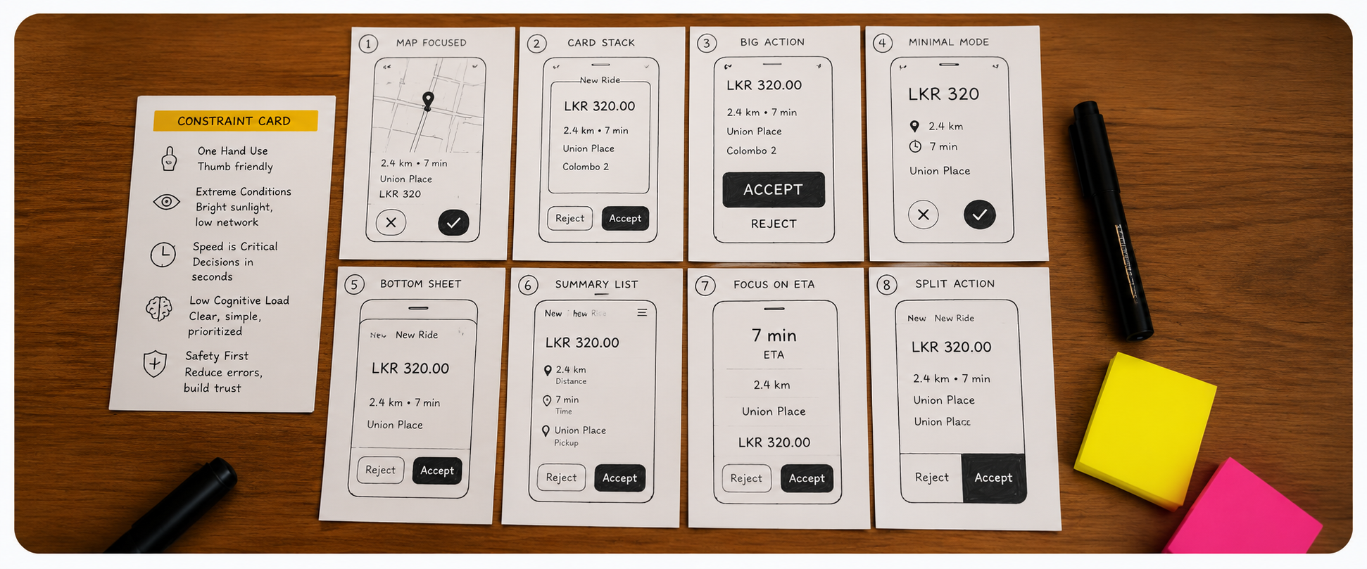
↑ Crazy 8s sketches the constraint card ("sunglasses, shaking thumb, no English") produced dramatically different output from standard UI sketching. Three winning concepts emerged: swipe-to-accept, ultra-high-contrast type, haptic differentiation.
Paper Prototype Testing in a Moving Vehicle
We built paper prototypes of 5 layout variations and tested them in moving vehicles. Participants were asked to respond to a trip request while the researcher simulated road conditions this was not a conventional usability session. Mis-tap rates and decision speed were measured per layout. The "swipe-to-accept" variant had zero mis-taps in 30 trials.
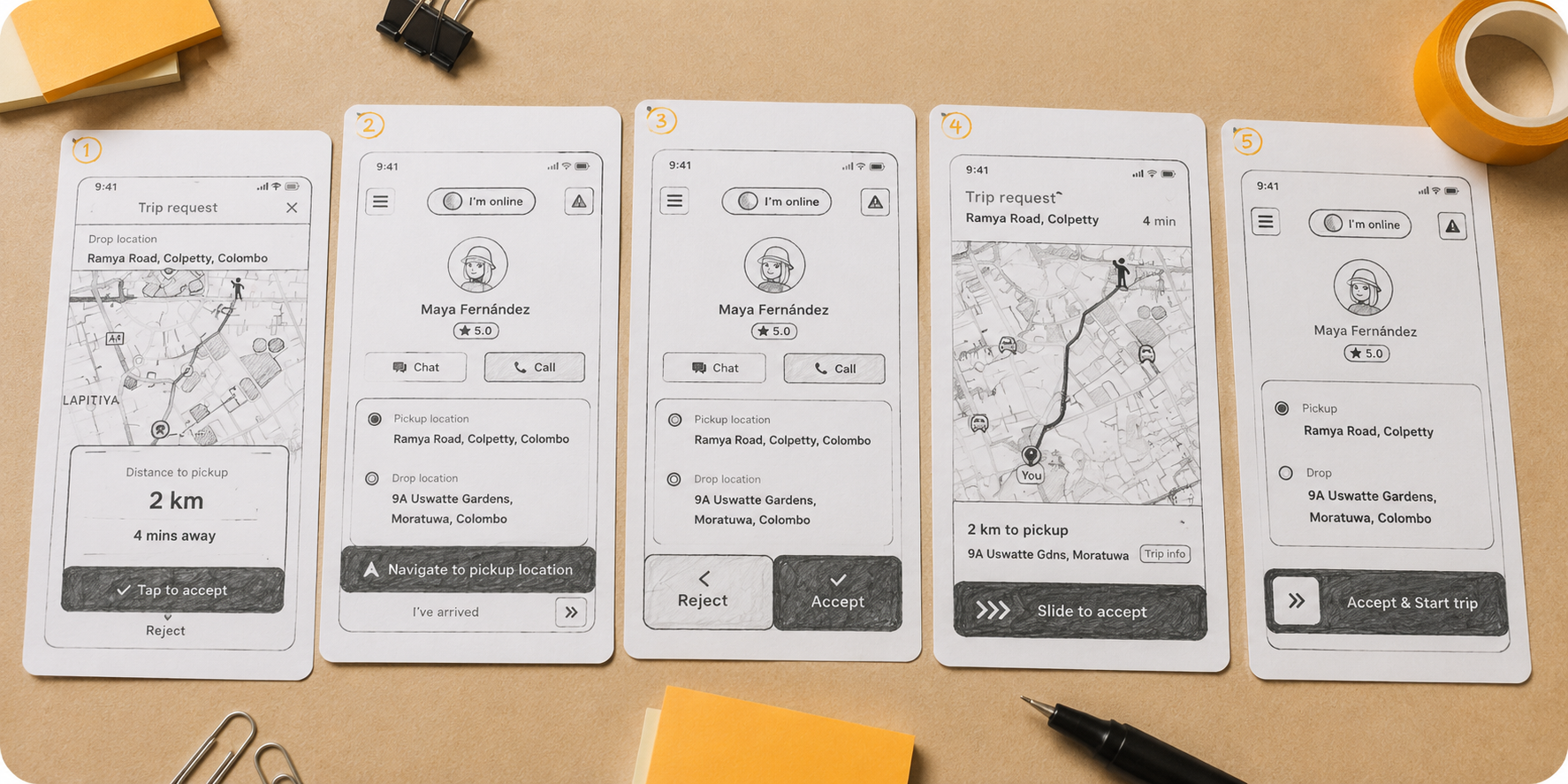
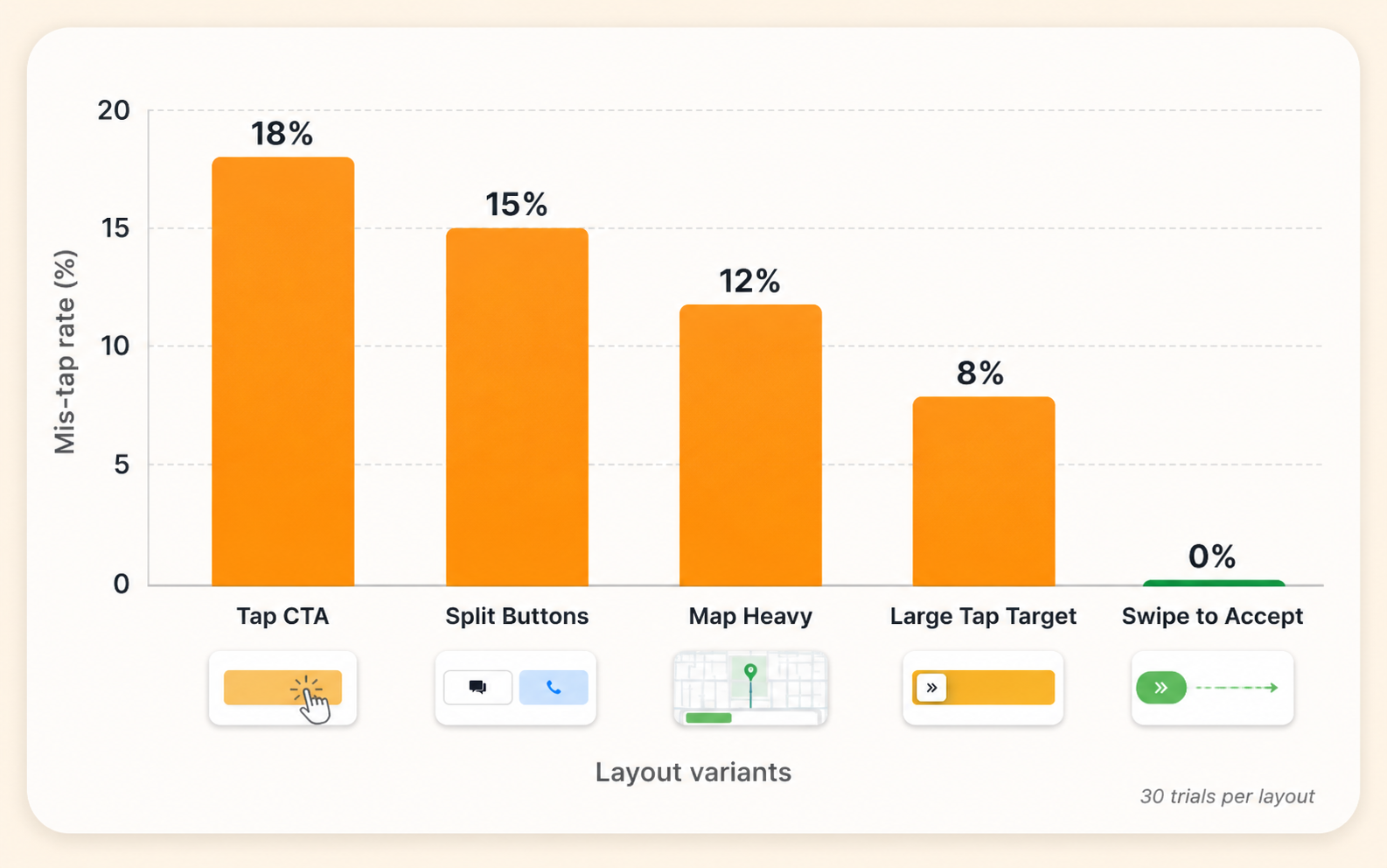
↑ Paper prototype testing in a moving vehicle 5 layout variants, 30 trials each. The swipe-to-accept gesture produced zero accidental rejections across all trials.
Prototype Testing Moderated Sessions (n=15)
High-fidelity prototypes were tested in structured usability sessions with 15 active PickMe drivers. Tasks mapped the full trip acceptance flow. SUS was measured at baseline (original app) and after prototype testing. Participants also rated their confidence level after each interaction a custom metric to capture the emotional dimension of the driver experience.
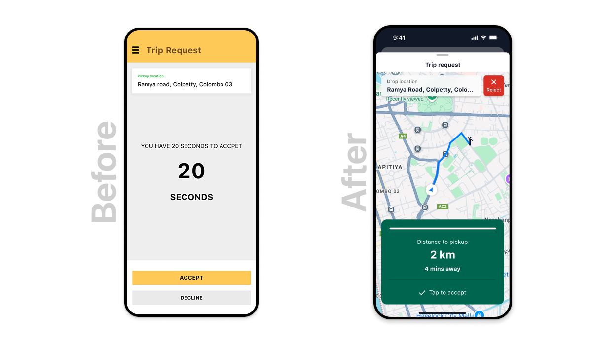
↑ Before vs After original trip request UI (left) vs redesigned interface (right). SUS: 48 → 82 across same tasks, same participant profile, n=15 prototype testing sessions.
The choices that shaped the outcome and what we sacrificed
Decision 01 · Swipe-to-accept vs tap-to-accept
Tension: Swipe requires more intentional effort some drivers felt this slowed them down. Tap is faster but produced 15% accidental rejections.
Choice & trade-off: Swipe-to-accept as the primary interaction. Speed loss was measured at ~1.2 seconds per decision a trade-off drivers unanimously preferred when they understood it eliminated accidental rejections. Zero mis-taps in prototype testing (n=15, 30 trials each).
Decision 02 · Pickup distance as primary hierarchy element
Tension: The business wanted trip price displayed most prominently it's a revenue motivation signal. Research showed drivers prioritise pickup distance first.
Choice & trade-off: Pickup distance as the largest text element. Price at secondary hierarchy. This required stakeholder negotiation resolved by showing that drivers who understood their decision better accepted more profitable trips, not fewer.
Decision 03 · Single-language default vs multilingual localisation
Tension: Full Sinhala/Tamil localisation was a significant engineering investment. The team initially wanted to scope it out of v1.
Choice & trade-off: I advocated for icon-first UI design as a language-agnostic solution for v1, with localisation on the roadmap. This reduced the engineering lift while addressing the core accessibility barrier meaning relied on icons and colour, not text, for the critical trip acceptance decision.
Decision 04 · Haptic differentiation for accept vs decline
Tension: iOS and Android haptic APIs behaved differently consistent cross-platform haptic UX required platform-specific implementation work.
Choice & trade-off: Shipped platform-native haptic patterns short pulse for accept confirmation, long pulse for decline rather than attempting cross-platform uniformity. Drivers reported the haptic feedback as a significant confidence signal, particularly in loud environments where audio alerts couldn't be relied on.
The redesigned driver experience built for one-handed use in direct sunlight
High-fidelity designs were validated across 15 prototype sessions before handoff. Each screen state was tested against the three primary constraints: outdoor legibility, one-handed operation, and decision speed under time pressure.
↑ State 1: Incoming trip request pickup distance as the primary visual element, large accept area with haptic confirmation, WCAG AA+ contrast ratio maintained in direct sunlight testing.
↑ Icon-first trip type indicators validated with low-literacy users. Each icon meaning tested through recognition tasks, not label reading. Colour coding tested under direct sunlight simulation (screen brightness + ambient light condition).
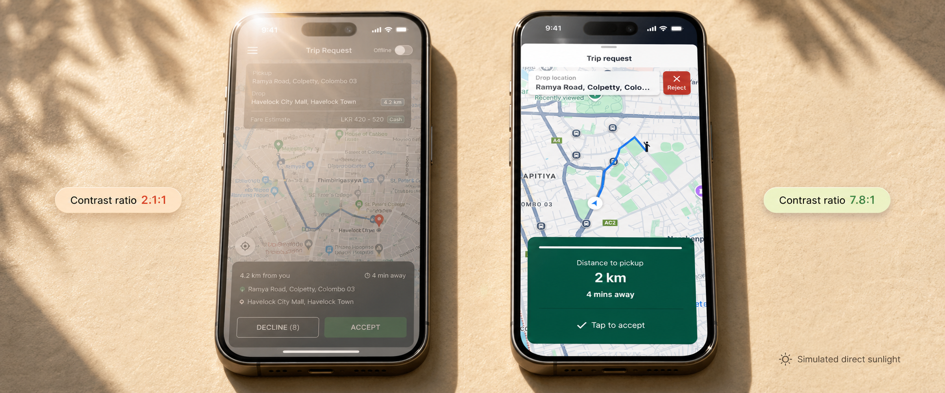
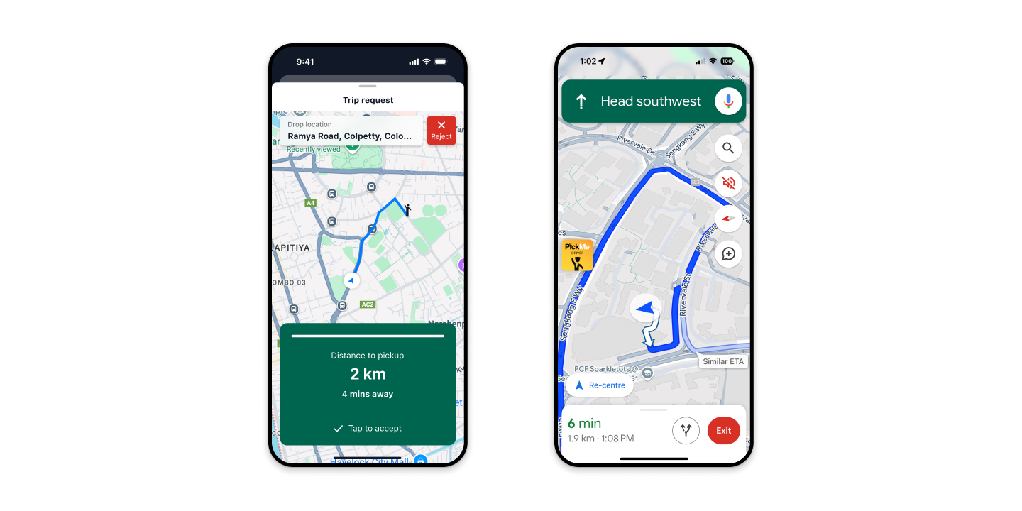
↑ Outdoor legibility comparison original UI left vs redesigned UI right under simulated direct sunlight. Contrast ratios: original 2.1:1 → redesigned 7.8:1 (WCAG AA+ compliant).
Translating field reality into a shared team language
The most important design work I did on this project wasn't in Figma. It was in a room with the VP of Operations, two PMs, and an engineering lead, explaining what I'd seen in 20 cabs over three weeks.
The journey mapping workshop as alignment tool
I used the journey mapping session not just to document the driver experience but to make the operations and product team feel the constraints viscerally. Showing a photograph of a phone screen washed out in direct sunlight changed the conversation in a way that data alone hadn't. The team stopped talking about "improving the UI" and started talking about "the 20-second window."
Negotiating the information hierarchy with the business
The business wanted trip price displayed most prominently. Research showed drivers decided on pickup distance first. I resolved this by demonstrating with prototype session recordings that drivers who saw pickup distance first made decisions faster and accepted more profitable trips, not fewer. The data resolved a stakeholder disagreement that framing alone hadn't.
Engineering collaboration on haptic implementation
Haptic feedback patterns required platform-specific implementation the iOS and Android APIs behave differently. Working directly with iOS and Android engineers early meant the haptic specifications were feasible before I committed to them in the design. This avoided a late-stage "we can't build that" moment.
Results prototype testing and platform trajectory
Usability metrics are from moderated prototype testing (n=15, same tasks as baseline). Platform-level metrics (rejection rate, driver rating) reflect platform performance during the period following the redesign these involve multiple factors beyond design alone.
Platform Trajectory
Over the period of this engagement (2015–2018), PickMe grew from a challenger product to a market leader in Sri Lanka's ride-hailing space. Driver supply growth and retention were cited by operations leadership as key factors in that trajectory. The driver app redesign was part of a broader product investment these platform-level outcomes involved many teams and factors beyond design alone.
Honest reflections including what I'd do differently
What Worked
Field research changed the brief
The original brief was to "improve the trip acceptance UI." After 20 ride-alongs, the brief became "redesign the 20-second decision window for extreme physical constraints." That reframe changed everything that followed. You cannot design for an environment you haven't experienced field research is not optional when your users' context is this different from your office.
Designing for the most constrained user makes it better for everyone
The constraints we applied large touch targets, ultra-high contrast, icon-first design, swipe gestures were driven by the most challenging user scenarios. But they improved the experience for all drivers. Accessibility-first design is not a compromise. It's a quality floor that raises the product for every user.
The journey mapping workshop was the most valuable artefact not the deliverable, but the alignment
The map itself was useful. But the real value was the shared understanding it created in the room. After that session, the VP of Operations started pushing back on engineering trade-offs that would have compromised the driver experience. Design had changed the culture of the conversation.
What I'd Do Differently
Push for full localisation in v1, not v2
I scoped Sinhala/Tamil localisation to the roadmap to reduce engineering complexity in v1. The icon-first solution was effective, but full linguistic localisation would have addressed a deeper dignity issue drivers using the app in their own language, not making do with icons because the system wasn't built for them. I'd push harder for that from the start.
Involve female drivers in field research from the beginning
Our ride-along cohort skewed heavily male. Female drivers in Sri Lanka face a different set of safety concerns and in-app behaviour patterns. Their input arrived too late in the process to influence some early structural decisions. Diverse driver cohorts are not just an equity requirement they surface different product failure modes.
Establish production measurement instrumentation before launch
We had strong prototype testing data, but production measurement was limited. Advocating for specific analytics instrumentation accidental rejection rate tracking per screen state, time-to-decision distribution would have given us production evidence to validate the prototype findings and make the case for future investment more cleanly.