Building a Scalable Management Platform for a SaaS Product
Modernizing an internal finance portal to handle complex reconciliation, reduce errors, and scale operations for enterprise clients.
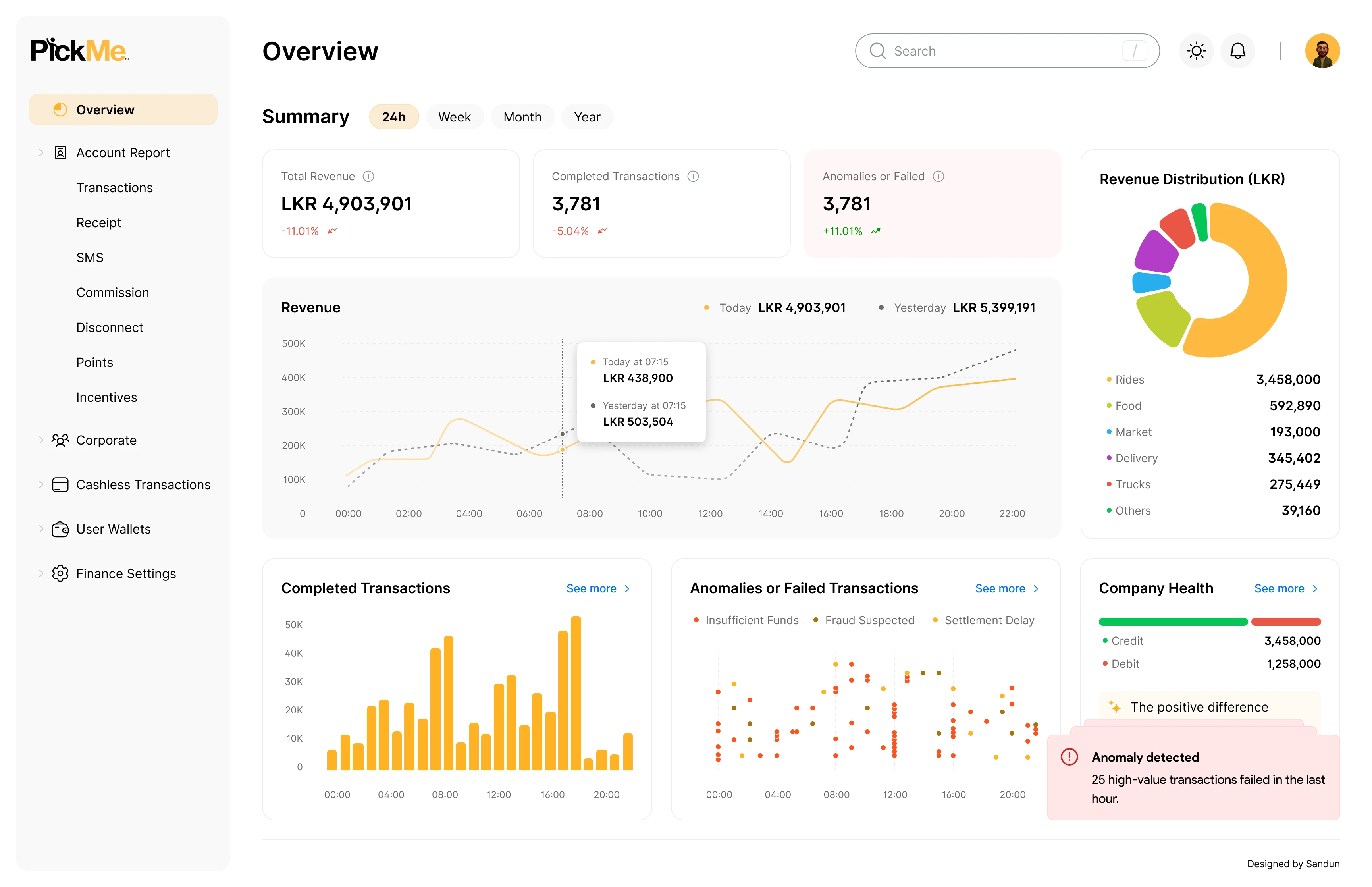
↑ The redesigned finance dashboard providing clear oversight and quick actions for reconciliation.
The Challenge
Handling corporate transactions was becoming a bottleneck. The finance operations team was using an outdated, rigid internal portal to reconcile hundreds of thousands of transactions daily. It previously took analysts an average of 4 hours a day to reconcile these accounts.
As PickMe scaled its corporate SaaS offering, the existing platform caused high error rates and required significant manual intervention to track outstanding payments and settle accounts.
↑ The legacy system required users to cross-reference multiple disjointed screens.
"Finance teams need certainty and speed. When systems are fragmented, analysts are forced to act as human bridges between disconnected data points, driving up operational costs and delaying settlements."
Three compounding failures slowing down operations
High cognitive load
Staff had to cross-reference multiple disjointed screens to reconcile a single corporate account. Information was scattered across different views, forcing users to keep data in their head while navigating the portal.
Rigid workflows
The system forced users into strict linear paths, making bulk processing and error handling extremely tedious. If one step failed, the entire process often had to be restarted manually.
Lack of real-time visibility
Missing proactive alerts meant issues were often discovered reactively, leading to delayed settlements. Users found out about transaction failures only when clients complained or reports didn't match.
Mapping friction: Why manual workflows break at scale
To truly understand the operational breakdown, I shadowed 5 finance operations specialists over 2 weeks during peak billing cycles to observe their workarounds. I then mapped out their daily friction through an Empathy Map. This shifted the conversation from "adding features" to solving deep systemic frustrations.
Says & Thinks
"I spend more time fixing errors than actually reconciling accounts. Why can't I see everything in one place? Is this batch going to fail again?"
Does & Feels
They manually export transactions to Excel, cross-checking logs in a stressful, fragmented workflow. Feel overwhelmed during peak billing cycles and anxious about data accuracy.
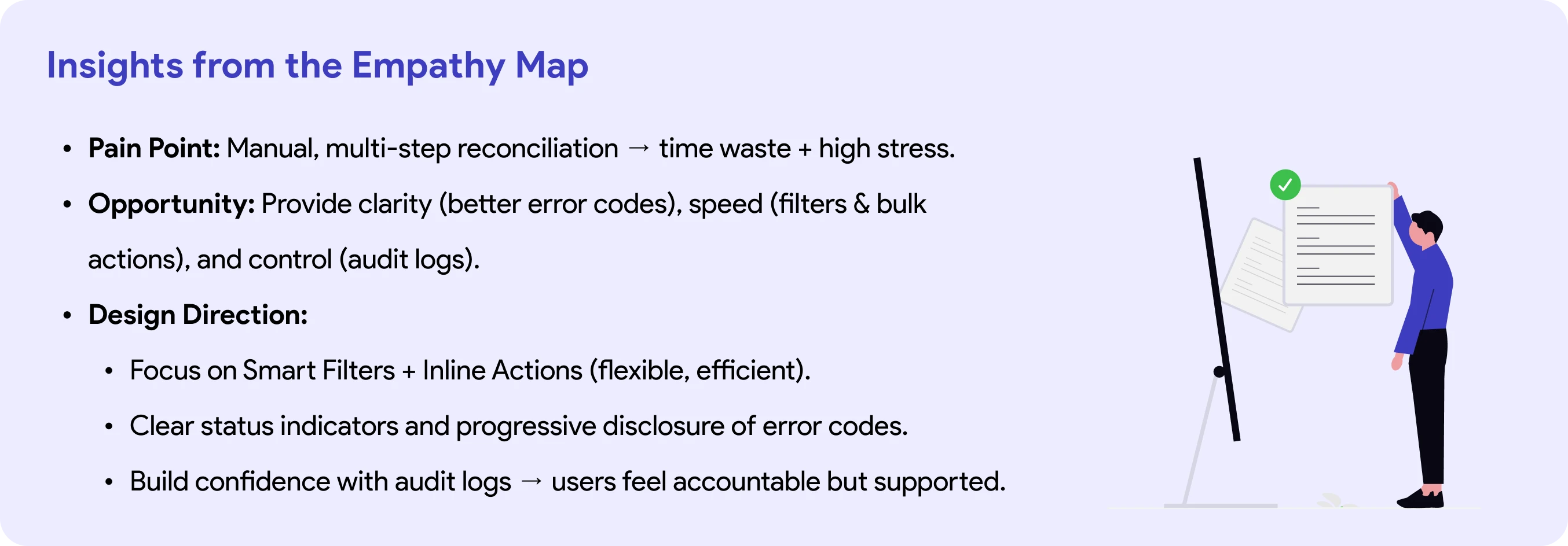
↑ Key insights extracted from our empathy mapping, driving our design direction.
Mapping the Flow & Wireframing
Before jumping into high-fidelity pixels, I mapped the current user flow, which took 8 distinct steps, and redesigned it down to just 3 essential steps. I created low-fidelity wireframes to quickly validate the structure with the product team.
↑ A simplified user flow diagram cutting out 5 redundant steps from the legacy process.
Designing for Power Users
Enterprise finance tools are heavily used by "power users" who rely on speed and bulk actions. I ensured the new wireframes accounted for full keyboard navigation and designed explicit error states for edge cases, like what happens when a bulk resolution of 10,000 transactions fails halfway through due to system latency.
Concept Ideation
1. Batch Wizard
A guided, step-by-step flow that takes a failed transaction (or group of them) through reconciliation like a checklist.

2. Smart Filters
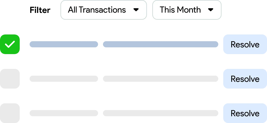
Users apply dynamic filters to a transaction table and resolve failures inline, either individually or in bulk.
3. Real-Time Alerts
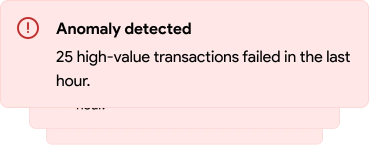
Immediate push notifications or in-app alerts when anomalies or failures happen.
The redesigned management experience
The final high-fidelity screens focused heavily on surfacing the right data at the right time, minimizing clicks, and standardizing the UI for a fast, trustworthy experience.
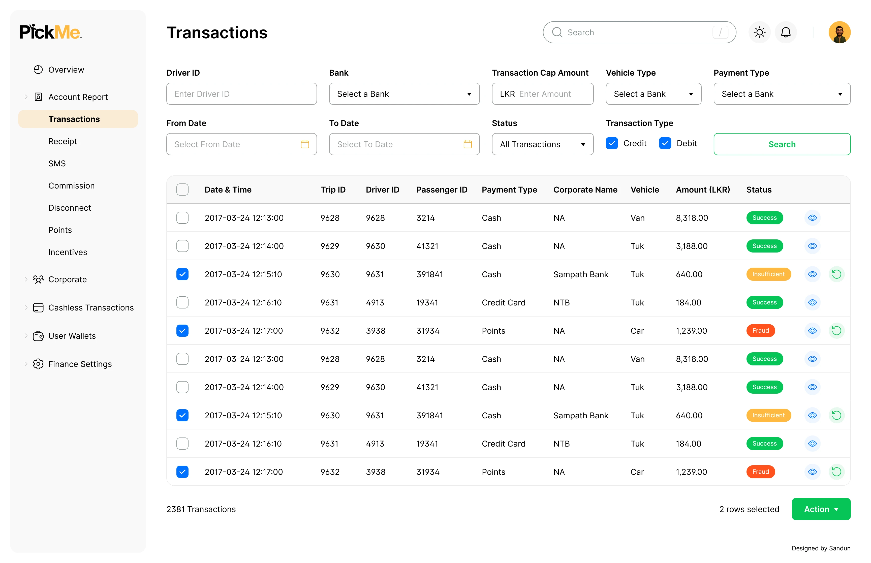
↑ Smart Filters replacing the rigid wizard approach, enabling flexible queries and bulk actions.
↑ Real-Time Alerts keeping the operations team ahead of potential settlement failures.
How we arrived at the solution
Affinity Mapping
Synthesized qualitative feedback from 30+ internal Ops users by grouping sticky notes into thematic pain points regarding the old CRM.
Role-Based Access Control (RBAC) Ideation
Collaborated with Security and Ops leads to define exactly what UI elements should be visible to different tiers of admin users.
Illustration Placeholder
Prompt: A clean 3D isometric illustration of a B2B SaaS management platform, with glowing indigo and blue modular UI blocks and floating data charts. Rendered as a clean illustration on a fully transparent background (no backdrop, scene, or color fill), so it displays cleanly on both light and dark page themes.
Measurable impact and business value
By trusting user feedback and pivoting from our initial assumptions, we delivered a platform that significantly streamlined operations.
1h/day
(75% faster)
Reconciliation time
- Avg. steps reduced per reconciliation.
- Bulk resolution usage.
- Tool-switching eliminated.
30%
Lower Error rates
Through clearer logs
- Misclassified transactions reduced.
- Retry success rate improved.
- Manual reporting errors decreased.
Higher
Confidence in
real-time monitoring
- Ops team satisfaction (NPS/CSAT, already in your draft).
- Training/onboarding time reduced.
- Support tickets about reconciliation dropped.
"The new smart filters saved me from working weekends during the end-of-month close. It feels like the system is finally working for us, not against us."
Sarah, Finance Operations Manager
Honest reflections from the process
What Worked
Validation prevents waste
Testing the Batch Wizard concept early saved months of engineering effort. It proved that enterprise power users need flexibility and oversight, not just hand-holding.
What I'd Do Differently
Earlier engineering alignment
Early data access was inconsistent, which complicated some of the UI flows. Next time, I would involve the backend engineering team earlier in the discovery phase to ensure API feasibility aligns perfectly with the proposed UX.